If you have a website that isn’t converting as well as you’d like, you’re not alone.
Many business owners of every size face this challenge. After investing in a brand new website it can be disheartening to not see it immediately get incredible results for you business.
The good news is that there are strategies you can implement to improve your conversion rate.
Is Your Website Built For Your Users?
A high-converting website is one that meets the needs of your users. While it’s tempting to design the website of your dreams, you won’t be the one using it.
Start by understanding who your visitors are and what they are looking for. This means conducting research and gathering data about your customers. How do they like to shop? How do they contact you? Do they have any challenges that your website needs to resolve so they’ll get in touch?
Once you have this information, you can adjust your website to meet their needs and encourage them to get in touch.
While each website will be unique to your business, there are a few basics to always keep in mind. Your website should be visually appealing, easy to navigate, and responsive on all devices. Make sure your
content is clear, concise, and answers the questions your visitors are likely to have. All of these things will make your website more likely to convert and drive revenue.
Regularly Testing Your Website for Frustration
Even the most well-designed websites can have issues that frustrate visitors and prevent them from converting to customers.
Regularly testing your website helps identify these pain points. There are several methods you can use, such as user testing, heatmaps, and analytics.
User testing involves observing real users as they navigate your site, which can reveal unexpected problems that when you’re close to the project, you miss.
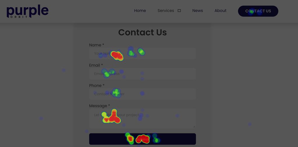
Heatmaps are one of the most common ways of seeing how visitors use your website. They show you where users are clicking and how they are scrolling, helping you understand their behaviour. It will show which parts of your website they don’t see, can’t find and ignore. For example, if your phone number is only in the bottom left of your footer, a heatmap will show you if your audience even scrolls down far enough to see it.
Test Key Parts of Your Website
Certain elements on your website play a crucial role in conversions.
The most common elements to test and improve are headlines, call-to-action (CTA) buttons, images, and forms. These are the features that direct visitors around your website, images that show who you are and then the form to capture their information so you can make a sale. If these don’t work, you don’t get leads.

A/B testing is a popular method for testing key elements. It involves creating two versions of a page (or element) and showing them to different segments of your audience to see which performs better. For example, you might test two different form types to see which one gets more submissions or test different colours for your CTA buttons to see which one leads to more clicks.
This work is never done, as your business grows and your website expands you should be regularly testing these new features to maximise the chances of each visitor converting into a customer.
Prioritise Key Actions and Make Them Easy to Do
If it’s difficult to do, your customers won’t do it. Long forms, hidden contact information and websites that simply don’t work will massively hurt your conversion rate. To make it easy for customers to contact you, these are some quick best practices you should implement.
Have phone numbers visible
If your business relies on phone calls for leads or sales, make sure your phone number is prominently displayed on your website. Place it in the header, footer, and contact page and make sure it stands out.
Easy forms
Forms are a common way to capture leads, but if they are too long or complicated, visitors will give up filling them in. Keep your forms short and simple. Only ask for information you need for that initial sale. For example, if you need to contact a customer, asking for their name, email, and phone number should be enough.
If you’re completing a transaction, gather only the information necessary to process it. While collecting birthday, product preferences and where they heard about you would be nice to know, they aren’t essential and having a shorter more effective form is better than the data.
You can always fill in gaps in data later!
Partner with Purple Orbit
Improving your conversion rate can be a time consuming process, and you don’t have to do it alone.
Partnering with us can take this off your plate and you know we’re doing everything we can to make your website work harder for you.
Our team will work with you to understand your goals, analyse your website, and make website changes to boost your conversion rate. From user research to A/B testing, we can help.
Contact us today for a quick call about your goals and how we can help you get more from your website.
Wed, 17 July 2024

